My best artwork this semester would probably be the portrait because it was the best looking drawing and I had a lot of fun making it. I would like to redo my final artwork because at home the other night I drew a really cool drawing and I would rather have seen how that turned out instead. In art I learned how to draw faces better and now if I end up taking more art classes which I might I will already know how to draw more faces. I don't think there was anything specific I wanted to do in art class I liked what we did.
0 Comments
Standards EvidenceClaude Monet some ideas i had from him was how he did his backgrounds. I think art is really fun and I think people should take art classes just to try something new .art helps me calm down and i just really like drawing and this year my drawing is getting a lot better.
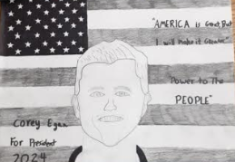 For my portrait I drew Mr. Egan a Presidential banner. While drawing this I learned you had to pay more attention to detail then other art works. I also learned that while drawing faces there is a lot of different shading. When I started drawing this I started by drawing his jaw line and connecting it to the top of his hairline. I used pencil for basically everything except I used a sharpie to make the flag darker. I liked drawing this artwork because it was really fun to try and work on faces and look at shading. Standards
This artwork is meaningful because it is a teacher that me and the original artist mess around with the teacher and he's a pretty cool teacher and he likes the joking around. people viewing this may think its a sorta cool that we did it for a teacher but it's more of an inside joke for us so not everyone would look at it and think it's cool or funny. I chose to put this artwork in the teacher's room because he thought it turned out cool and liked the artwork
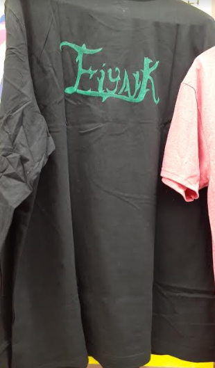
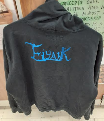
for printmaking I printed my last name on the back of my sweatshirt and a shirt. my plan is to print my first name on the front of my shirt. while printmaking I liked how it worked and how it turned out. when I did my sweatshirt not all of the ink stuck to the sweatshirt so it looks like its fading in the k and it looks really cool. the only thing i'm not the biggest fan of is the clean up because it sticks to your hands.
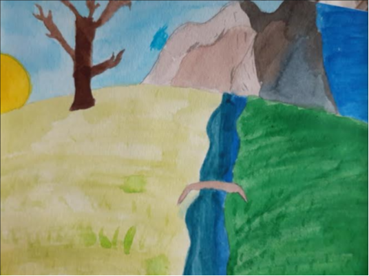
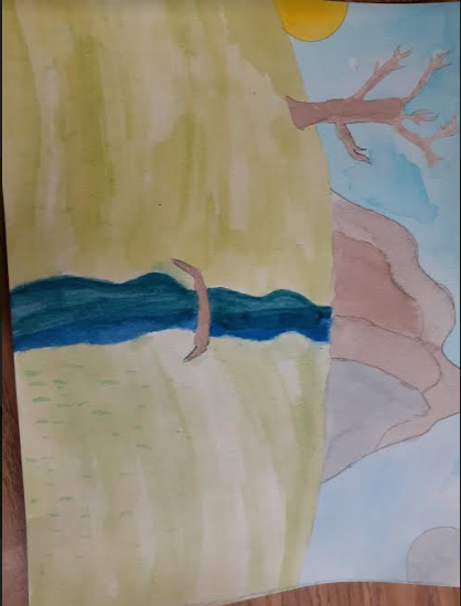
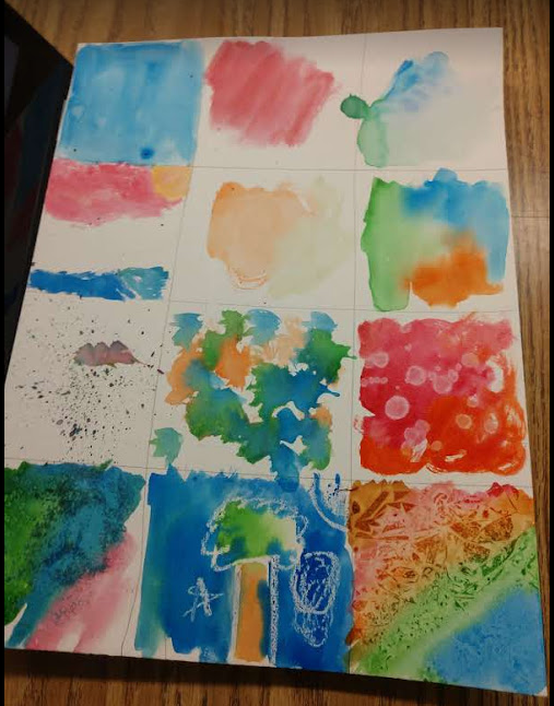
My artwork is a landscape with light on one side and darkness on the other. on the left side there is lighter grass with a tree on the edge of the horizon and on the left of the tree is the sun coming up. your viewing from the middle of the river going up the mountain range with a bridge in the middle. on the right side is darker with darker grass and the moon up in the sky. the mountain range is a dark shadow and the sky is night.
I sketched this artwork out first and then I layered it with liquid water color paints. I started with light layering and then went darker. The thought of this is there is a light and dark side to everything. another way to look at it is its peaceful in nature. my goals is to get better at drawing and painting my thought on this isnt what i thought would turn out better then what it turned out to be
My artwork is a landscape of mountains in the background with a moon in the top right corner and a sun just coming up on the horizon on the left of the artwork. there is dark shades towards the moon and the grass is darker then the side with the sun. the water has a darker look towards the moon because it's the darker side. I chose this artwork because everything has a dark side and sometimes the dark side is higher than the light inside of the object.
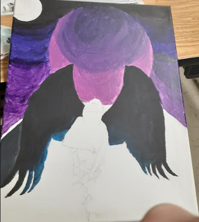
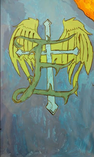
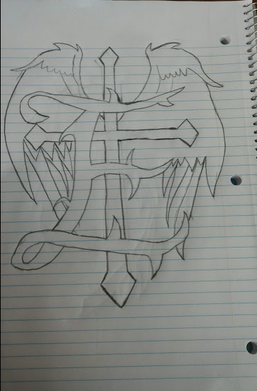
My artwork is a E with points at the ends and points sticking out. The E is on top of a cross with angel wings. on the cross there are cracks and shading on the edges. the crosses ends are points. the angel wings have separate wings all the way down. the wings go above the cross. there is a sun in the top right corner with cracked like shading. there are different shades of blue as the background. lighter blue towards the sun and darker the farther you get. the E is a dark greenish blue. the cross is a light blue. the wings are a light greenish red.
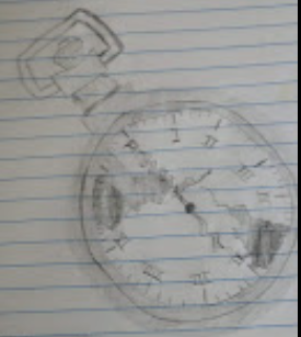
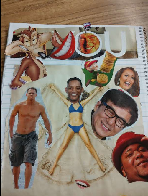
The S drawing is the original drawing that is from a band. the E is the remade drawing and the S inspired me. I drew the watch at home because i got boredthis is the artwork that i have been doing over the past couple weeks. I used collage, pen and ink, water color, and charcoal and water. I was surprised on how the charcoal turned out. I didn't even know that you could use water with charcoal. the pen and ink turned out better than I thought to. I would be excited to use the pen and ink again. it was a really fun project and I like how it turned out. I wasn't a big fan of the water color but i like how some of them turned out.
As an artist right now, I feel like I'm ok at drawing but I'm not very good with paint. I want to get better at drawing. I feel ok about taking risk, it won't stop me from trying something new. I'd really like to work with chalk pastel.
|
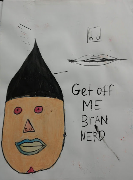
Authorsup Nerd, im isaac, i play a lot of battlefield Archives
January 2020
Categories |
 RSS Feed
Photo used under Creative Commons from bnilsen
